Overview
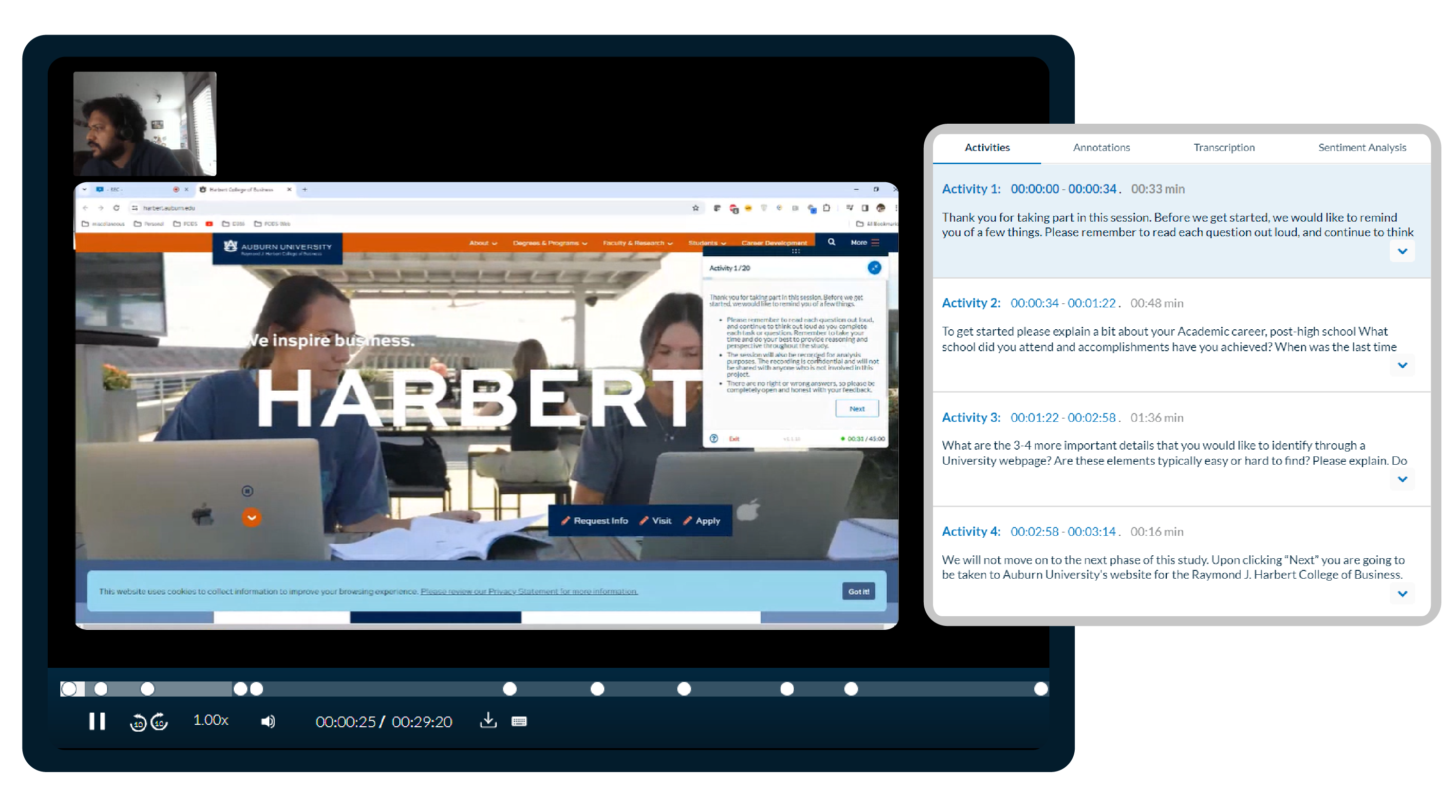
Unmoderated studies play a pivotal role in the UX Research journey, shedding light on critical issues and pain points. They serve as a potent tool for iteration, allowing teams to gauge the impact of adjustments while minimizing UX researcher intervention. Despite their hands-off nature, unmoderated studies yield rich qualitative UX feedback.
Our partner and client, Auburn University, recognized the importance of understanding user requirements and expectations for one of their college websites. Leveraging our platform, they embarked on a mission to dissect user behavior and feedback meticulously.
Armed with these insights, they aimed to implement targeted recommendations, subsequently measuring their impact on user perception through iterative testing cycles.

The Challenge
Auburn University set out to enhance the user experience of their Raymond J. Harbert College of Business website, a critical touchpoint for prospective applicants and current students alike. The objective was clear: to elevate the website’s usability and perception, ensuring seamless navigation and access to essential resources for all users, regardless of their familiarity with the institution.
This initiative entailed a comprehensive audit of the site’s homepage, program pages, and various user flows. To validate the effectiveness of proposed changes, the study was divided into two distinct phases:
1. The first phase focused on identifying key insights and recommendations.
2. The second phase aimed to assess and measure the improvements made in phase one.

The Approach
To achieve this goal, we utilized the Userlytics platform to recruit participants from various regions across North America. This diverse group included individuals who had previously applied to universities online and were familiar with the process.
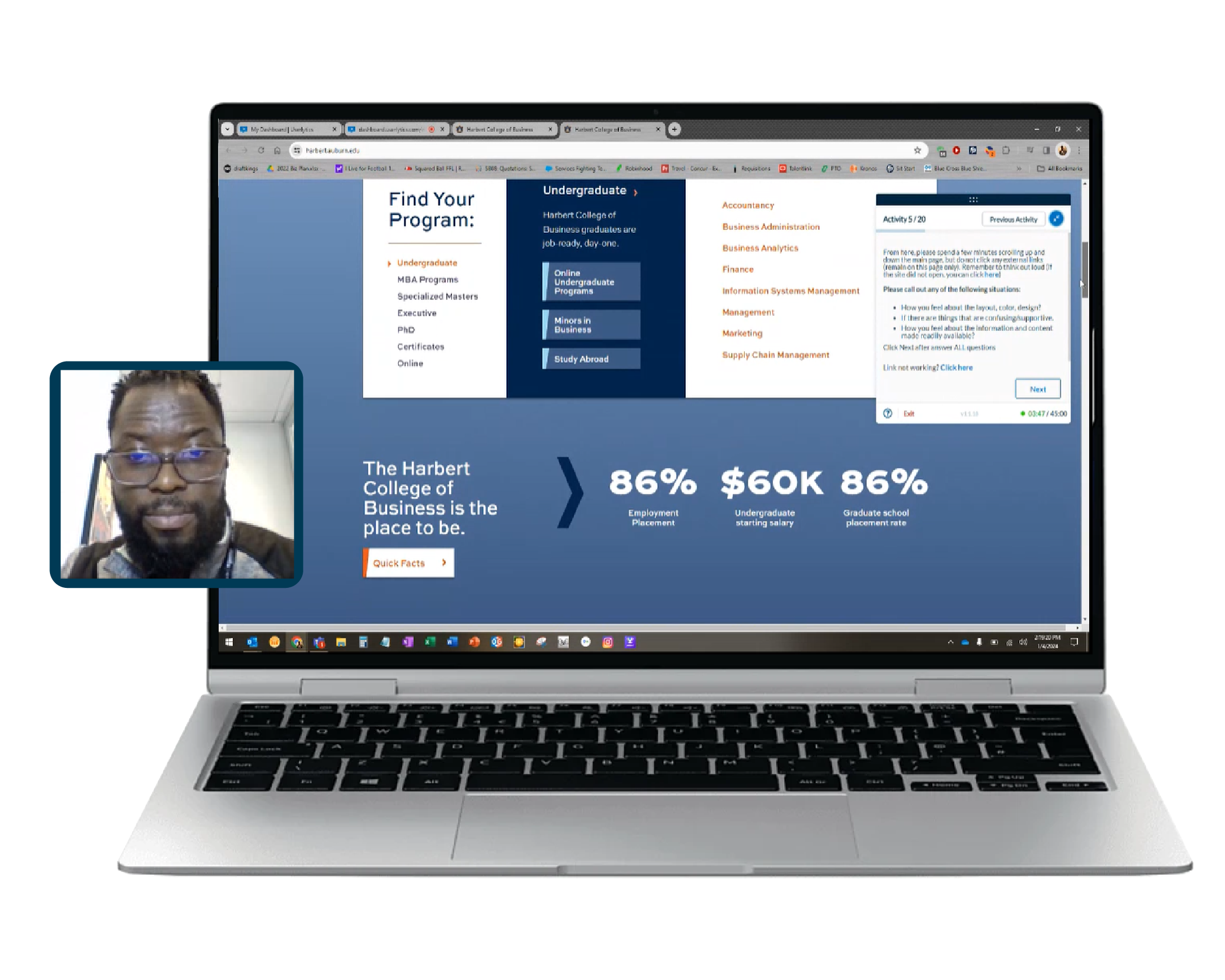
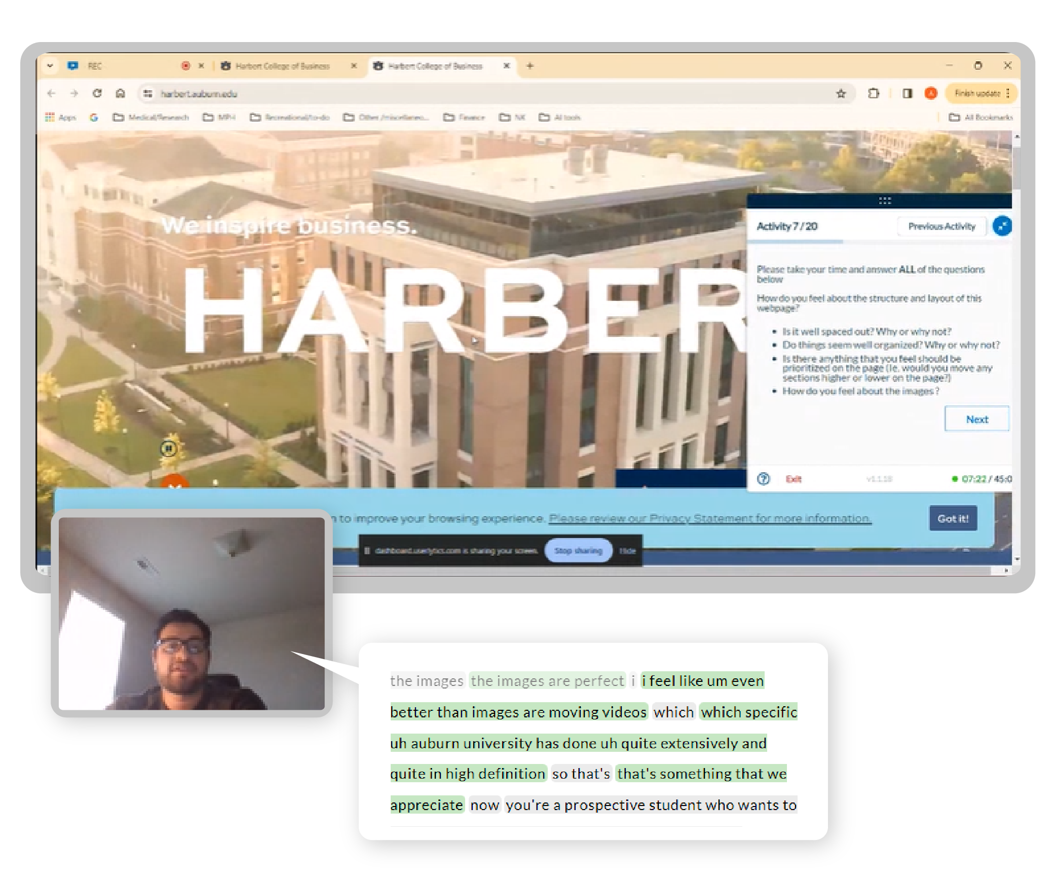
In the initial phase, Auburn University invited their own users to participate, ensuring feedback from both experienced and inexperienced users.During unmoderated sessions lasting 30 minutes, participants were tasked with exploring multiple pages and completing common website interactions. Our evaluation extended beyond surface-level aspects like content and layout; we delved into user interactions to assess their comprehension and expectations of typical user journeys, as well as the accessibility and placement of information.

The Insights
In the initial phase, we pinpointed the key areas of interest for users visiting the college’s main landing page. Their primary focus was on finding program details and additional college information, with slightly more complexity observed when seeking MBA programs.
The website’s layout, structure, and color schemes facilitated task completion for most users, aligning with their expectations regarding contact information and campus services access.
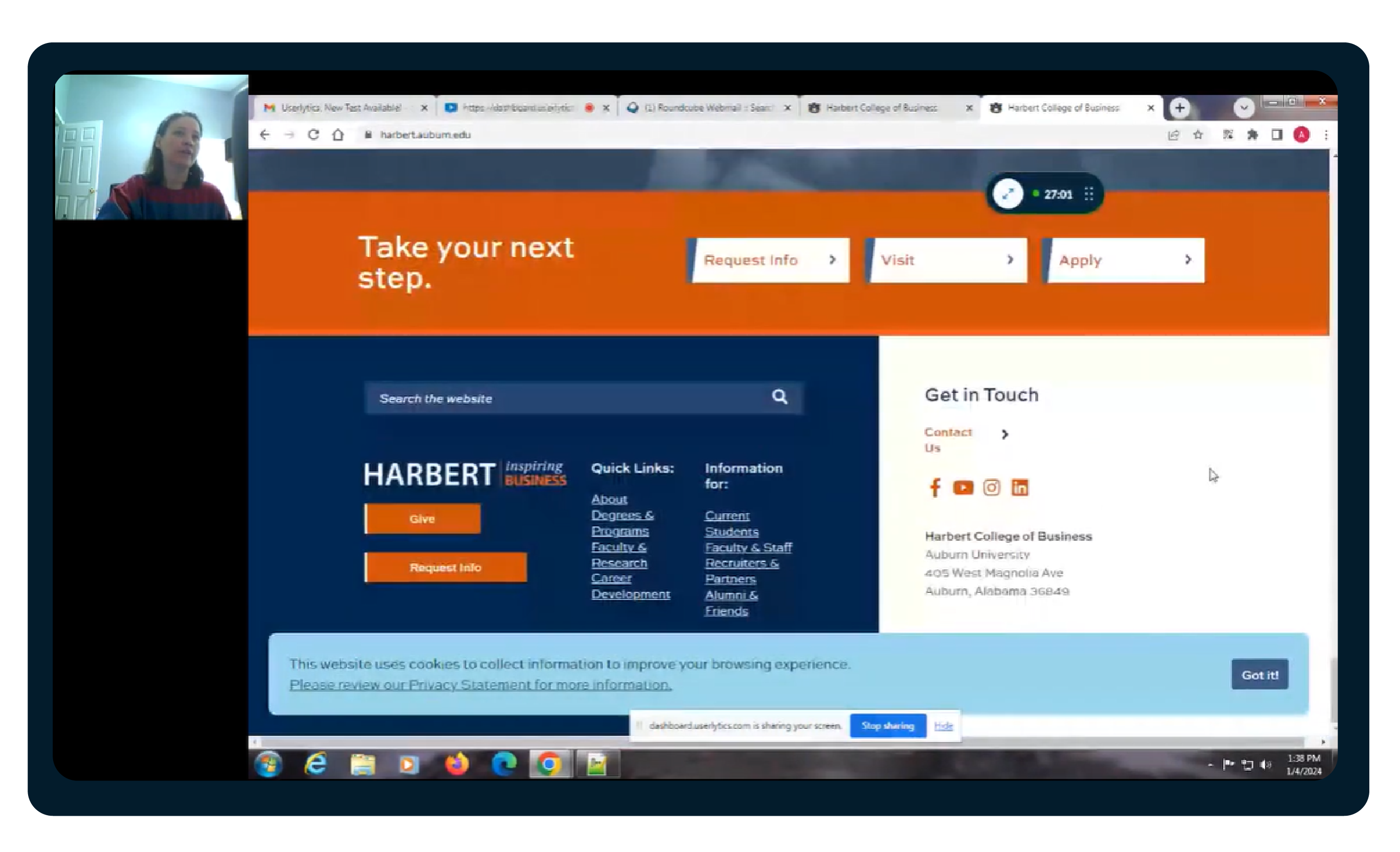
However, a common UX challenge arose in locating the feedback section, prompting users to resort to the contact form instead.
Following recommendations from the first round, Auburn University made improvements to their website, as reflected in user responses. While users still appreciated the overall landing page structure and program offerings presentation, locating the feedback form remained an issue for some.
After the second round of testing, users provided varied feedback, reflecting the impact of the changes made. Although the ULX® Benchmarking Score saw a notable drop, likely due to fewer users familiar with the website, overall user-reported issues were less severe, particularly regarding MBA program information. This indicates a successful outcome for the user experience study.
*** The Userlytics platform is a catalyst of ux testing and accessibility testing, and the platform continues to help organizations become compliant with accessibility standards, curating an inclusive and diverse user experience for all digital assets. Reach out to us today to support you on UX testing journey***


